The Art of Layering Textures in Interior Design
Mastering the art of layering textures in interior design involves skillfully combining different materials to enhance depth, comfort, and visual appeal. You’ll start with larger items like sofas and rugs, then incorporate smaller elements with varied textures. Harmony is essential—ensure no single texture dominates your space. Balance the rough with the smooth and the glossy with the matte to create a visually stimulating ambiance. Remember, your color choices greatly impact how your textures are perceived. The key is to keep experimenting and adjusting. By digging deeper into this art, you’ll discover more secrets to transforming your living environment.
Understanding Texture in Design
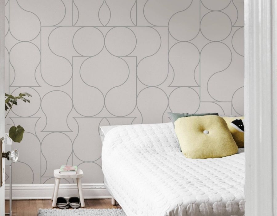
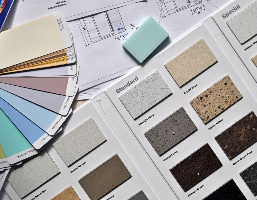
Often, texture is the unsung hero of interior design. You may not realize it, but it’s a crucial element that adds depth and dimension to your space. It’s that soft rug underfoot, the smoothness of your marble countertop, the rustic charm of a brick wall. Each texture imparts a different feeling and creates a unique ambience. It’s not just about visual appeal, but how a space makes you feel.
By understanding texture, you can create a home that’s not only visually pleasing but also comforting and safe. Imagine stepping into a room with harsh and sharp textures; it wouldn’t feel welcoming, would it? But a space with soft, warm textures? It’d feel like a sanctuary, a safe haven.
Importance of Layering Textures
Mastering the art of layering textures can elevate your interior design from good to truly enchanting. It’s a crucial aspect of design, because it adds depth and visual interest. Imagine a room with flat, uniform textures. It might be safe, but it’s also dull, uninviting. Now, picture a space with a variety of textures: a plush rug underfoot, a velvet couch against a brick wall. The room instantly feels more dynamic, warm, and inviting.
Layered textures aren’t just about aesthetics, though. They also contribute to your comfort and well-being. The softness of a throw pillow, the cool touch of a marble countertop, the rough grain of a wooden table – these tactile experiences affect how you perceive your surroundings, how you feel in a space. They can make your home feel more personal, more ‘you’.
Basic Principles of Texture Layering
So, you’re ready to bring this design magic into your own home by learning the basic principles of texture layering. Here’s the deal, understanding these principles isn’t just about making your space look good, it’s about creating a safe and comfortable environment.
Firstly, don’t be afraid to experiment. Layering textures is all about trial and error. It’s about finding the right balance that suits your style and your home. Start with your largest items like sofas and rugs, then layer with smaller items such as throws and cushions.
Secondly, consider the scale and proportion. Large textures work well in large spaces and smaller textures for smaller spaces. You don’t want to overwhelm or underwhelm your room.
Lastly, remember contrast is key. Combining opposites, such as rough and smooth, creates visual interest. But, don’t go overboard. Too much contrast can be jarring.
Keep these principles in mind and you’re well on your way to master the art of texture layering. With a bit of practice, you’ll create a home that’s not just visually appealing, but safe and comfortable too. Now, isn’t that a comforting thought?
Mixing Fabrics and Materials
Three elements can truly transform your space when it comes to mixing fabrics and materials: variety, balance, and harmony. Variety is your secret weapon. Don’t be shy about blending different patterns, colors, and textures. A well-placed velvet throw can contrast beautifully against a leather couch, creating a dynamic, sensory experience.
Balance is about making sure no single texture overwhelms the others. It’s not about playing it safe, but about ensuring all textures have their moment to shine. That rough-hewn wooden coffee table? Pair it with a plush rug, and you’ve got a match made in heaven.
Harmony is the final piece of the puzzle. While it’s great to experiment, you want your textures to work together, not against each other. A silk curtain might not jive with a rustic burlap sofa cover, so think about how all your textures will coexist.
Balance and Contrast in Texturing
Achieving balance and contrast in texturing is like conducting a symphony of surfaces within your space. It’s about striking the perfect chord between the rough and the smooth, the glossy and the matte, the warm and the cool. When done right, this balancing act creates a harmonious ambiance that’s both inviting and pleasing to the eye.
But don’t be fooled, it’s not as easy as it sounds. It requires a keen eye and a delicate hand. Start by choosing a dominant texture, something that’ll carry the theme of your room. It could be the sleekness of polished wood, the softness of plush fabric, or the ruggedness of exposed brick.
Once you’ve picked your key player, it’s time to introduce the supporting cast. Layer in contrasting textures that’ll enhance and highlight, not overshadow, your chosen lead. Remember, it’s all about balance. If you’ve gone for a smooth, glossy texture, consider adding a touch of matte or rough elements for contrast.
Think of it as a safe adventure, a way to experiment without going overboard. With the right balance and contrast, you’ll create a textured symphony that’s music to your eyes.
The Role of Color in Texture Layering
You might not realize it, but color plays a pivotal role in the layering of textures in interior design. It’s the secret ingredient that can either make your design soar or sink. It’s a tool that, when used wisely, can enhance the textures in your space, making them more noticeable and impactful.
Think about it: an all-white room might look chic and clean, but it’s the color that brings warmth, interest, and personality. It’s the color that makes the texture pop. Without color, textures can lose their appeal, their charm, and their ability to draw the eye.
But it’s not just about choosing any color. You need to pick the right color. A color that complements the texture, that accentuates its beauty, that makes it stand out. You don’t want to choose a color that clashes with the texture, or that makes it fade into the background.
Textural Interplay in Different Styles
Every style of interior design calls for a unique interplay of textures. In a rustic setting, you’ll find a symphony of raw, natural textures. Rough hewn woods, rugged stone, and tactile fabrics all collaborate to create a comforting, safe haven. Contrast this with a modern design scheme, where smooth, polished surfaces reign supreme. Here, the sleekness of glass, the chill of metal, and the softness of a plush rug underfoot create a textural interplay that’s dynamic yet controlled.
Venture into a bohemian styled space and you’re met with an eclectic mix of textures. The soft, worn leather of a vintage armchair, the rough grain of a repurposed wooden table, the lush softness of layered rugs – it’s a sensory feast. And let’s not forget the classic elegance of a traditional design. Imagine the plush feel of velvet upholstery, the cool hardness of marble, the refined grain of polished wood.
Texture Layering Mistakes to Avoid
While layering textures can transform a space from monotonous to magnificent, it’s not without its pitfalls. There’s a delicate balance to strike and some common mistakes can disrupt your desired aesthetic.
To begin with, don’t overdo it. Too many textures can lead to a chaotic, cluttered look. It’s important to restrain yourself and select a few key textures that work in harmony. In addition, avoid using similar textures side by side. This can result in a dull, flat appearance. Instead, opt for a mix of contrasting textures to create a dynamic, visually appealing space.
Variety is key but remember, not all textures are created equal. Be careful not to use too many bold, dominant textures. They can overwhelm the space and distract from the overall design. A balance between bold and subtle textures guarantees harmony and depth.
Finally, don’t ignore the role of color in texture layering. Unrelated textures can seem disjointed if their colors don’t complement each other. Coordinating color and texture creates a cohesive, well-thought-out design that you’ll love and feel safe in.
Avoid these texture layering mistakes and you’re on your way to a beautifully textured interior.
Inspirational Layering Ideas
Having considered the pitfalls, it’s now time to unfasten the potential of texture layering with some inspirational ideas. Imagine a room where soft velvet cushions are nestled on a rugged leather couch, against an exposed brick wall. This combination not only creates a visual feast but also invites you to touch, evoking a sense of warmth and comfort.
Consider your bathroom. A simple layering trick is to pair glossy tiles with matte-finished accessories. The contrast between shiny and dull surfaces creates a visual interest, making your bathroom feel like a luxurious spa.
In your bedroom, mix textiles for a cozy, inviting feel. Pair a fluffy rug with smooth satin sheets, and drape a chunky knit throw over the end of the bed. The contrast of textures adds depth and dimension to your space, making it feel more personal and lived-in.
Achieving Harmony With Layered Textures
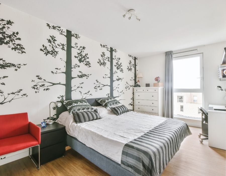
In the domain of interior design, achieving harmony with layered textures is akin to conducting a symphony. Each texture you introduce adds a new note, and it’s your job to guarantee that they all play together in harmony. If you’re unsure about how to achieve this, don’t worry. Here are three simple steps to guide you:
- Begin with a solid base: Start with a smooth, neutral base, like a plain wall or a piece of wooden furniture. This will serve as your canvas.
- Add contrasting textures: Introduce different textures that contrast with your base. Think velvet cushions, silk curtains, or a shaggy rug. These will add depth and intrigue to your space.
- Balance your textures: This is where the symphony comes in. You must guarantee that no one texture overpowers the others. Balance is key to achieving a harmonious look.